Our Story
Our brand is dedicated to quality, excellence and purpose. The history of Black economics, mainly, Tulsa Oklahoma's "Black Wallstreet" was the inspiration for the brand. Our goal is to bring awareness to the legacy of Black Wallstreet while restoring economic power in our communities.
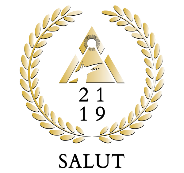
Explanation of the Original Logo

2119 is the reversal of 1921 which was the year Tulsa Oklahoma’s Black Wallstreet was burned down. 2119 is the year reversed and Salut is the backwards spelling of Tulsa if you swap the a and s, therefore 2119 Salut represents the reversal of our destruction and the reemergence of Black economic power and unity.
The pyramid symbolizes the foundation that our ancestors laid and the need for us to build modern pyramids of unity today!
The sun at the top stands for freedom which is what our unity will bring and the T in the middle stands for Tulsa. It appears wet due to the blood sweat and tears it took to build the economic emporium and what it will take today to do the same.
Our logo was designed by Triple S Designs & Graphics, LLC our number 1 partner for our graphic needs.
